A unique EVP
Client: NZ Super Fund
The Employee Value Proposition for The Guardians of NZ Super Fund brings together all the reasons that diverse members of the team thrive here.
The Brief
The Guardians of NZ Super Fund asked us to develop an employee value proposition (EVP) to engage existing staff in the culture, purpose and values of the organisation and to help attract the right people to join the team.
The Solution
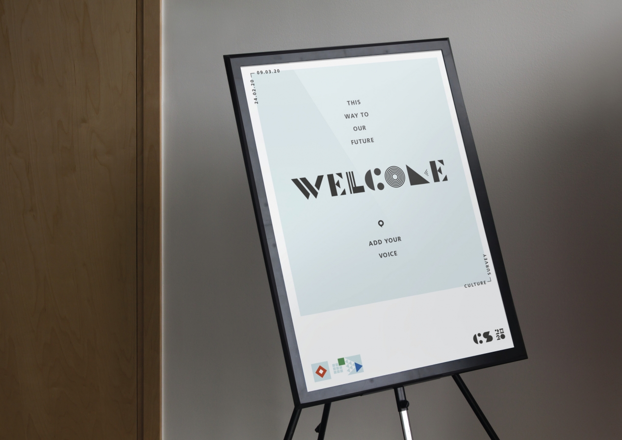
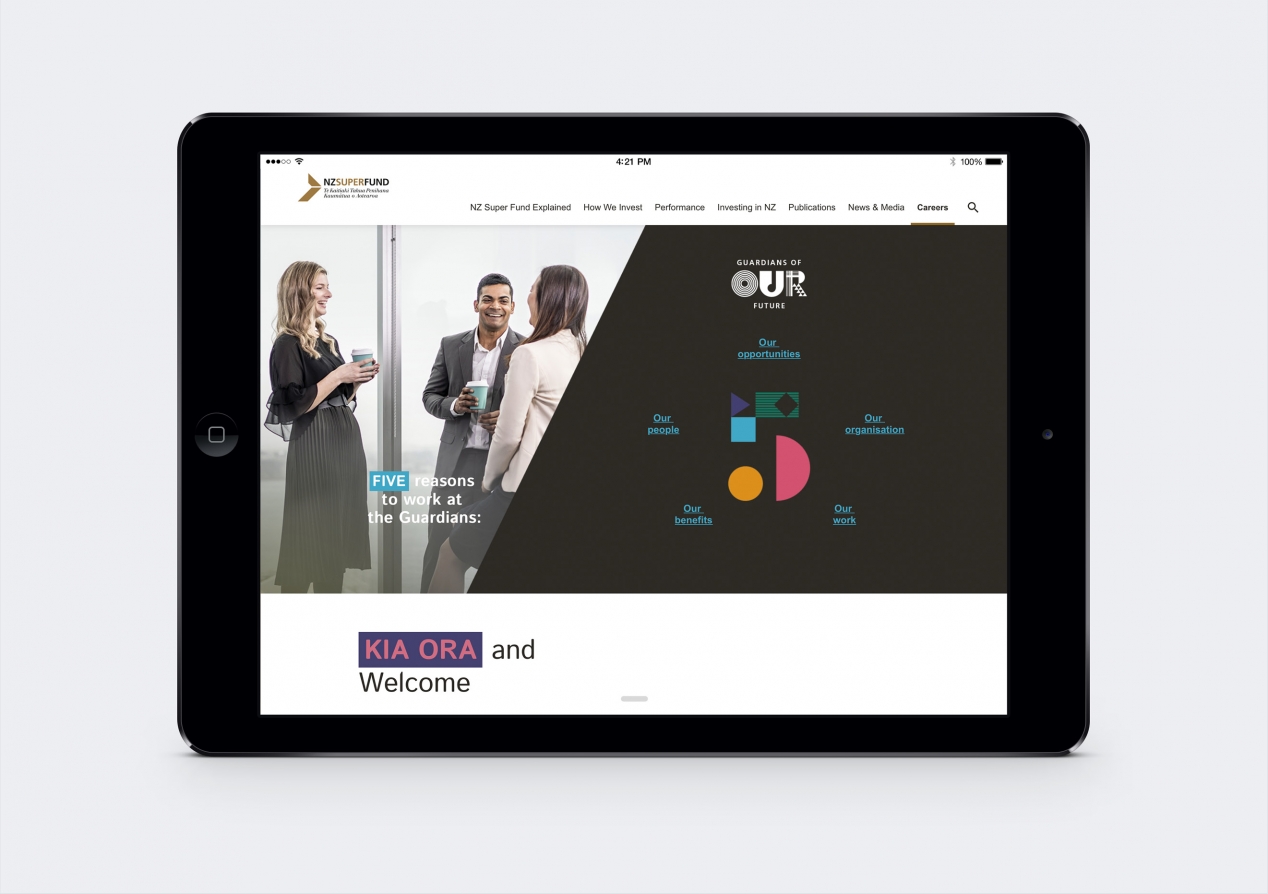
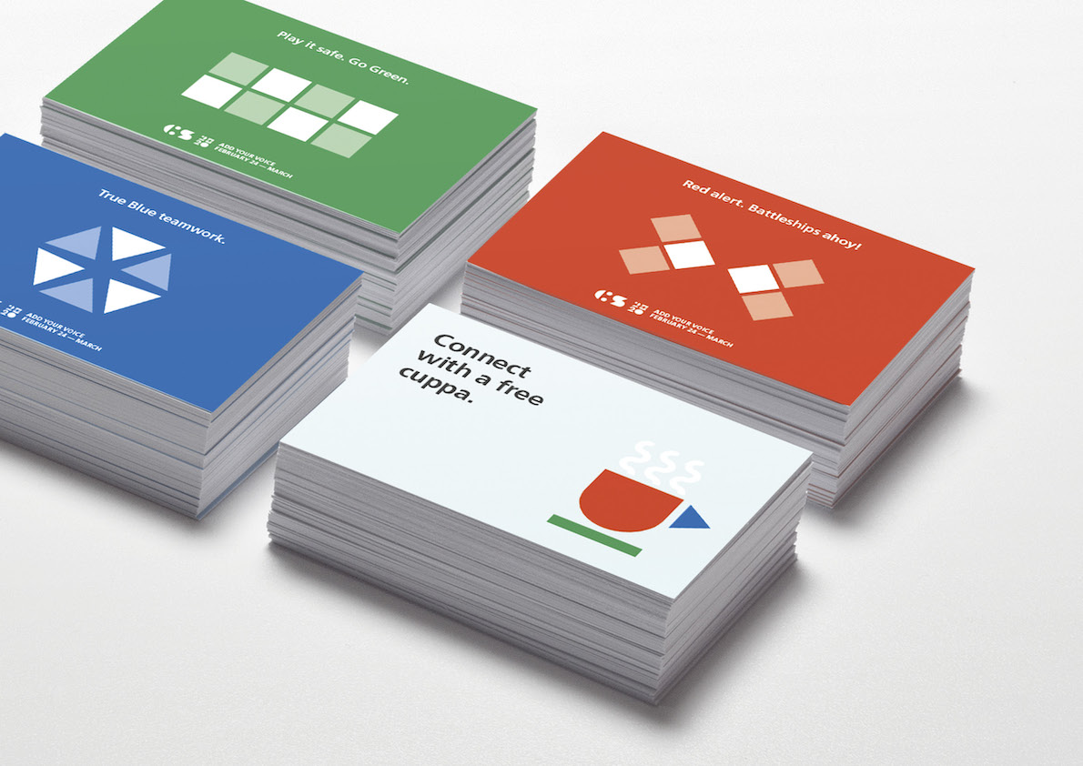
We started by developing a compelling EVP story, ‘guardians of our future’, to capture the five key reasons to be part of the Guardians team. These reasons inspired five shapes that formed the basis for a compelling typeface and identity that could communicate a variety of messages – from functional through to aspirational.
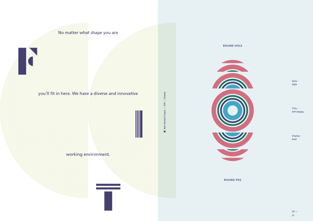
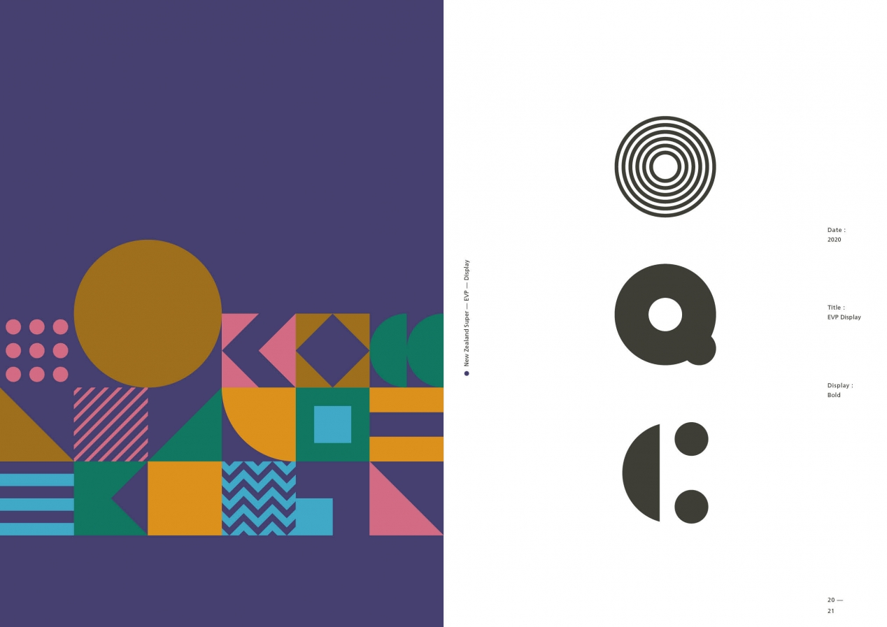
Combining multiple diverse shapes to form new shapes, icons and visual messages is a metaphor for many individuals bringing their unique strengths and characteristics together to deliver something greater than the sum of its parts. The approach reinforces the inclusive and welcoming environment that is core to the EVP proposition – “no matter what shape you are, you are welcome and belong here.”
The five shapes are triangle, oval, oblong, circle and square. These are shapes that are prominent in the graphic nature of Māori and Pacific arts and cultures, as well as in Asian and European calligraphy and design. Combining them delivers a universal appeal that is accessible, no matter what cultural background you are.
The familiar purity of geometric shapes sees them become the foundation of many creative arts which is why this typeface has a strong decorative aesthetic. The combination of straight lines and rounded forms, further reinforced by dynamic colours, combine in interesting ways to give a sense of innovation, energy, and fun. These are all qualities that are integral to the EVP proposition.
Unlike most typefaces which have defined characters, this typeface defines the components that can be used to shape each character – not the character itself. This adaptable approach means that each letter, number, punctuation element or graphic device can be formed in multiple ways – more pattern centric for fun orientated communications and more monocular for a more serious tone.
The result is a highly engaging, bespoke and versatile identity that literally says something new about the Guardians, and why you should be part of it, every time it’s applied.
The Results
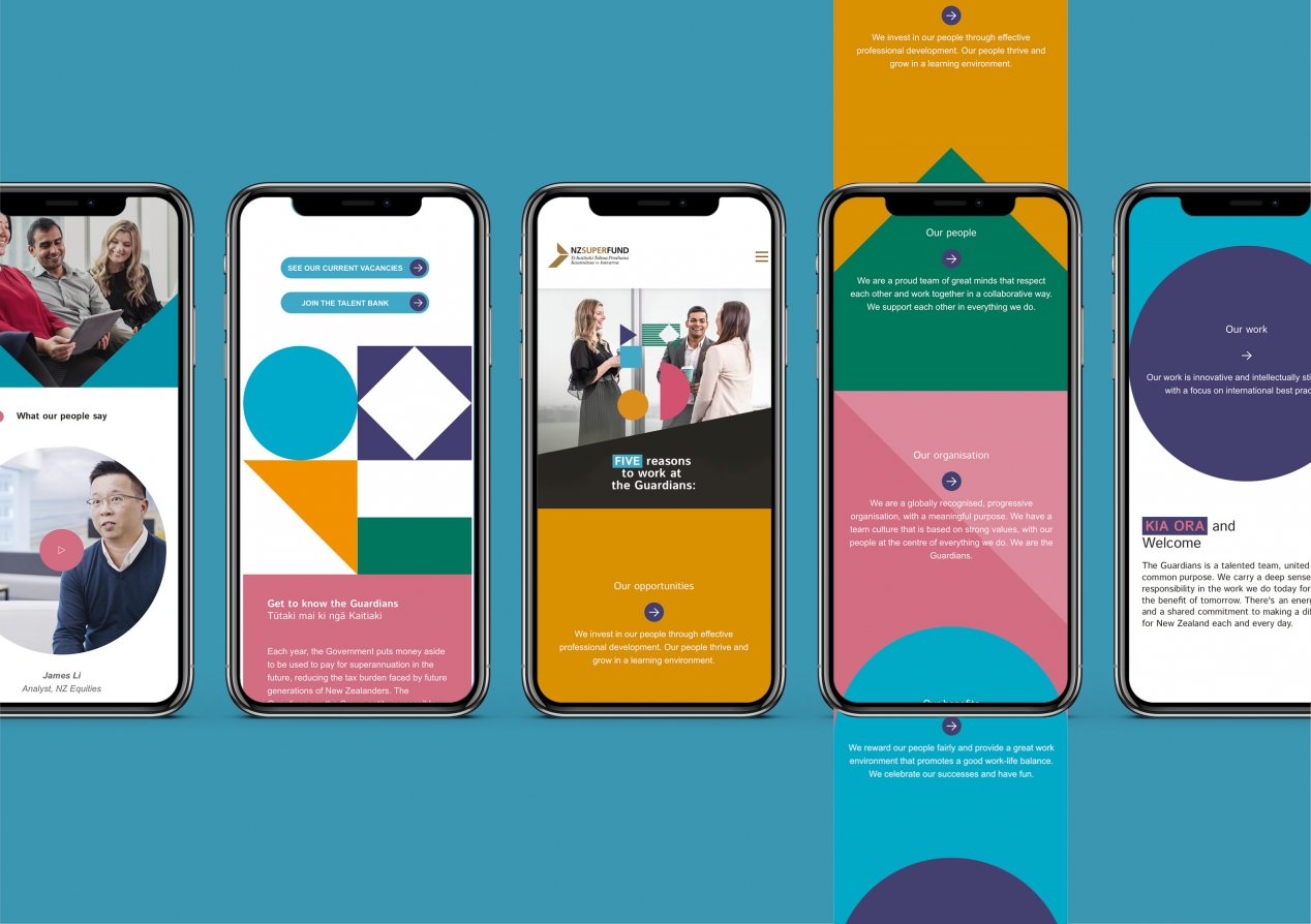
So far the system has been used for recruitment advertising, culture initiatives, risk communications, as part of regular internal communications and the basis for designing a new careers website. Feedback from staff, and prospects, has been very positive.