Creative Director, Brian Slade, looks forward to see what we’re likely to see emerging in our industry in the next 12 months.
“A trend never simply emerges for a single year and then disappears in a puff of smoke. Instead, an aesthetic becomes popular gradually, even mysteriously, over time before fizzling out slowly without much notice at all.” Madeleine Morley, The American Institute for Graphic Arts.
Forecasting trends with any certainty is tricky but here are ten possible aesthetic design trends to keep an eye out for and a few trends that may particularly impact us through this busier part of the year. Given that brands are about creating and maintaining competitive differential, following trends that dilute competitive distance can be counter-productive. The trick for a design agency like ours, is knowing when following such trends is ‘right’ for our clients. As usual, being true to the brand essence is the first priority. At the same time, being relevant, contemporary and appropriate to the business communication imperative is also at the top of our list. A healthy tension . . .
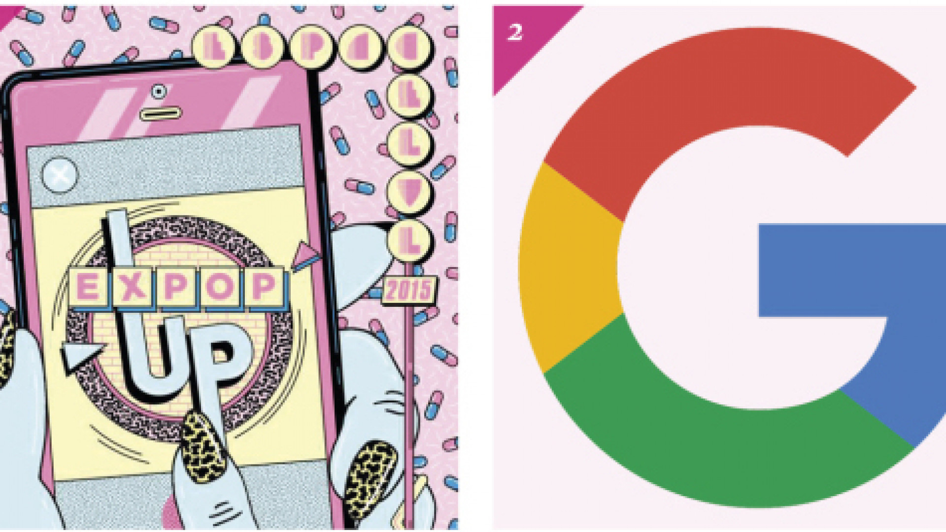
01. “Modern” Retro Style. Stylistic influences from more recent decades, the late 1970s through the 90s. Think early PCs and video games, pixel art, and space themes.
02. Material (flat) Design. Bold flat, graphic look.
03. Bright, Bold Colors. Fitting in with both 80s/90s styles, vibrant hues should continue to prove popular picks into 2016. Colors that transport us to a happier, sunnier place where we feel free to express a wittier version of our real selves.
04. Geometric Shapes. Geometric shapes, stipes and patterns applied in all sorts of ways. Also keep an eye out for a style known as “low poly,” which got its start as a 3D modeling technique for video games.
05. Negative Space Negative and/or white space is an essential part of any good design. But used strategically, negative space can be a clever way to add deeper or double meaning to designs, particularly for logo and branding projects.
06. Grids. Modular, card-based (grid) layouts have been adopted by some of the biggest brands for their websites and mobile apps.
07. Dramatic Typography. According to this trend, typography isn’t just for reading, the message is the medium. Look out for big, bold type that’s the center of attention.
08. Abstract, Minimalistic Style. This trend relies on less being more and deconstructing or distorting recognizable forms. Elements are picked apart and put back together in a unique way and a seemingly random layout.
09. Serifs get their due. While sans serif designs continually dominate the lists of top-selling typefaces in popular font marketplaces the serif can more than ever be reproduced with dignity and not degraded. Higher resolution screens becoming more prevalent increasingly they can handle the more delicate, refined nuances of serif typefaces and smaller sizes.
10. Prominent custom type and type awareness continue. Whether consciously or unconsciously, everybody knows type is everywhere. The San Francisco typeface, a design that debuted first for the Apple Watch, and subsequently rolled out for iOS and OS X El Capitan, continues the trend of the public becoming more aware of the importance (and, indeed, fashionability) of type.

