New office, new staff engagement opportunity
Client: Meredith Connell
A year on from our new branding for a revitalised Meredith Connell, a change in physical environment created the opportunity to embed the very essence of the brand into the very soul of the organisation.
Most untypical for a corporate law firm, the reaction to the branded environment from staff and clients alike has been one of genuine pride and admiration.
The Brief
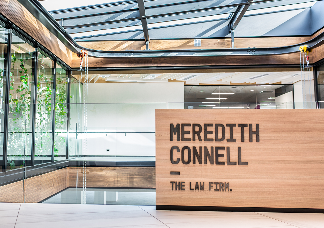
In 2015 we successfully rebranded Meredith Connell (MC). In early 2016, they relocated their Auckland offices from Shortland St. to Graham St. The fit out was undertaken by Warren & Mahoney and we were charged with bringing the brand to life in this unique work environment.
The Solution
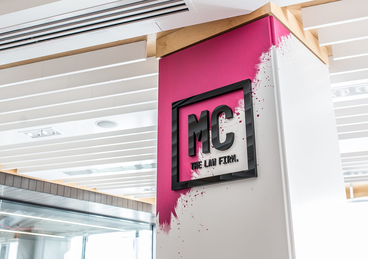
The MC brand is big on attitude. It’s bold and ballsy, demanding attention. A brand that celebrates results (not rhetoric), a client-focus and individuality. We wanted to apply these same ideals to making the office a unique brand experience. We started by creating two journeys – one for clients and one for staff.
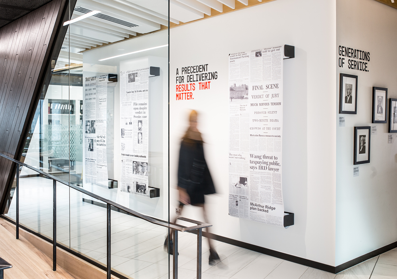
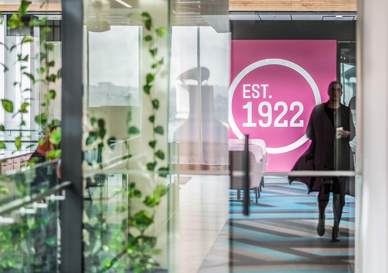
The client journey opens as soon as the lifts open with strong brand visuals. Visitors are greeted in reception by the infamous MC ‘blood splatter’ logo and bold brand messaging. This is followed by a ‘history wall’ where real results are presented in a montage of press clippings. The client journey continues into dedicated meeting areas and right through to the bathroom.
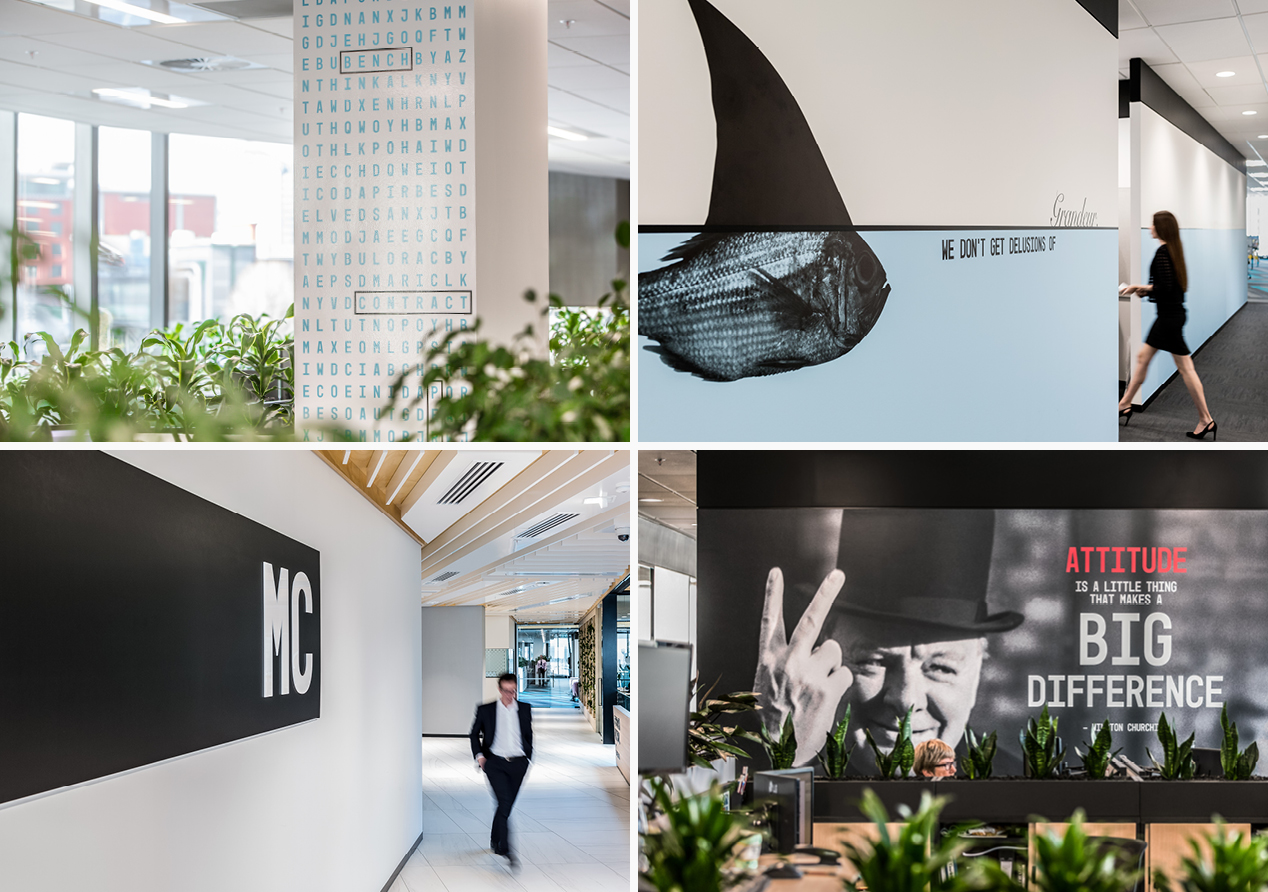
The employee journey gave us the opportunity to push the brand further, revealing itself in high traffic areas such as main thoroughfares, drinks/coffee stations, lockers, common spaces and meeting rooms.
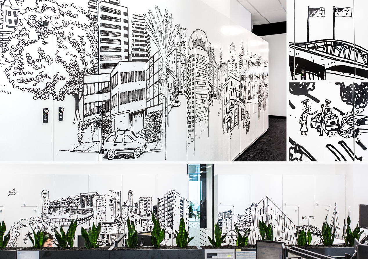
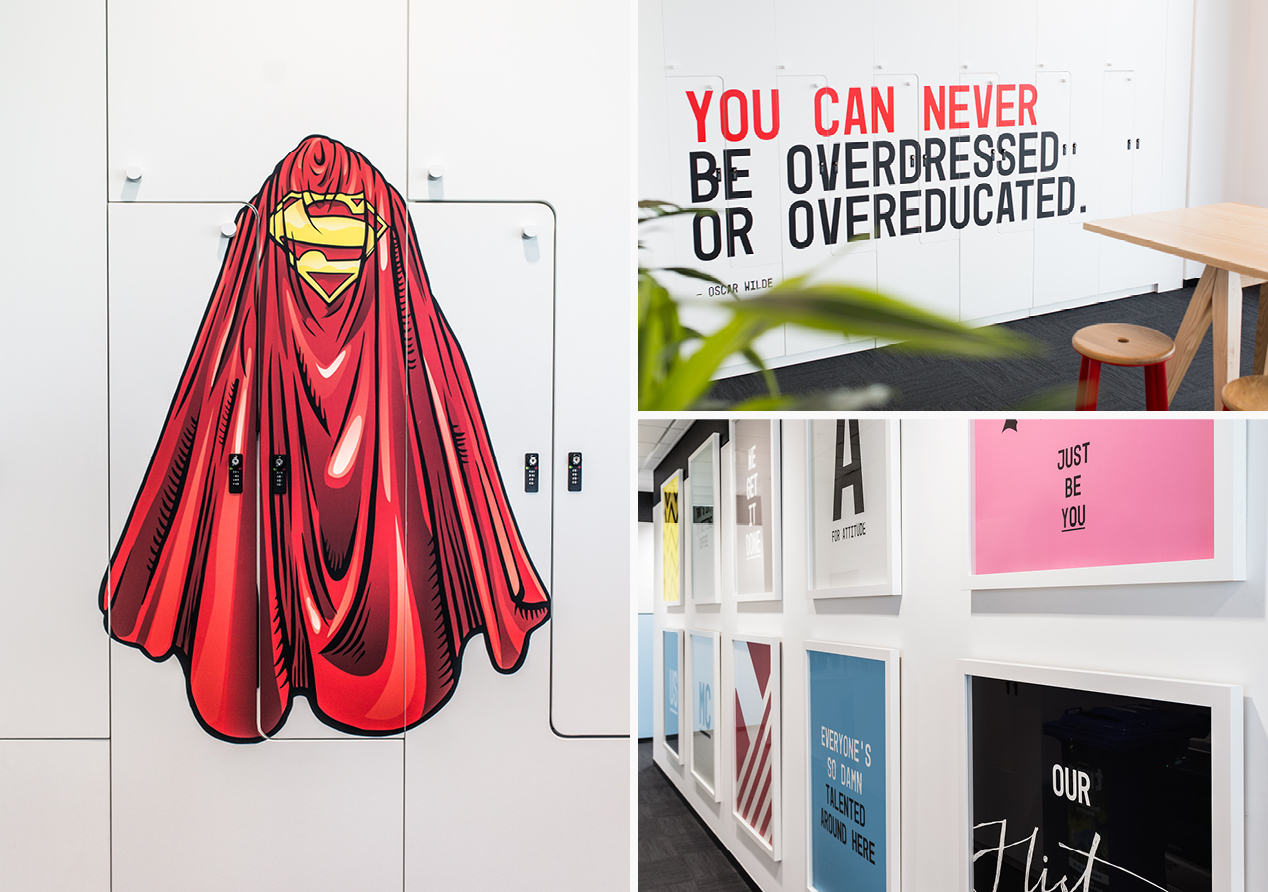
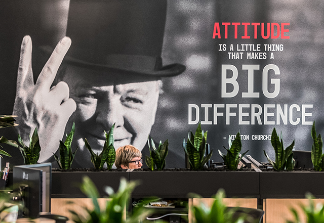
MC is not your typical law firm and they look for employees who also bring that something special and different to the firm. We wanted to play with this sense of unexpected, making each graphic application unique while always bringing the MC attitude. One wall features the irreverence of Winston Churchill. The lockers are decorated with a commissioned illustration showing their journey from the old to the new office (with a few hidden surprises along the way). A series of superhero capes inject aspiration and humour while word search pillars play up lawyers’ obsession with words. Many other applications feature the brand’s bold colours and messages.
The Results
MC has received widespread praise for its unique workspace and how it makes them stand out in a sea of corporateness. Clients love coming to the office and take the time to interact with the graphics and engage with the brand. Staff are blown away, fostering a sense of pride in the firm and what they stand for. And it’s impossible for them to not live the brand when the brand has such a presence in their daily lives. MC’s COO, referring to our brand and fit-out work, said: “You have transformed us.”