Design has the power to make a tangible difference to those who really need it writes Brian Slade.
I enjoy being a designer and sometimes I love it even more. Intuitively I know that the work we do changes how people feel about products, services, companies and even issues. However most of our clients are businesses which means we don’t often get to see the real impact our work has on the end consumer. Every so often though you get the chance to work on something so truly transformational that it literally changes lives and reignites your passion for effective design. This recently happened to me.
Children’s Health Camps (CHC) work to improve the lives of children, aged 5-12, who are at significant risk of harm as a consequence of the environment they are being raised in and their own complex needs. Driven by stakeholder feedback, CHC felt their existing name and identity reflected an organisation that may not be so relevant in today’s world. Our brief was to develop a name and visual identity that “captures the transformational difference they perform with New Zealand’s most vulnerable children and to express the passion and urgency they bring to their work.”
The inspiration for the new name, Stand, was Tane Mahuta, the mighty Kauri, which stands tall and proud. Standing together, its canopy protects and nurtures its seedlings to grow and reach their full potential. The creative idea for the visual identity ‘A brand of colour’ depicts the journey Stand takes children on, from darkness to light. Colour transition is a metaphor for bringing hope.
Bold colour along with a strong word mark, expressive typography, photography and graphic treatments form the basis of an open and adaptable visual identity framework. This flexibility is highlighted by the multitude of launch executions including a new website, social media pages, stationery, banners, brochures, signage, presentation material and much more.
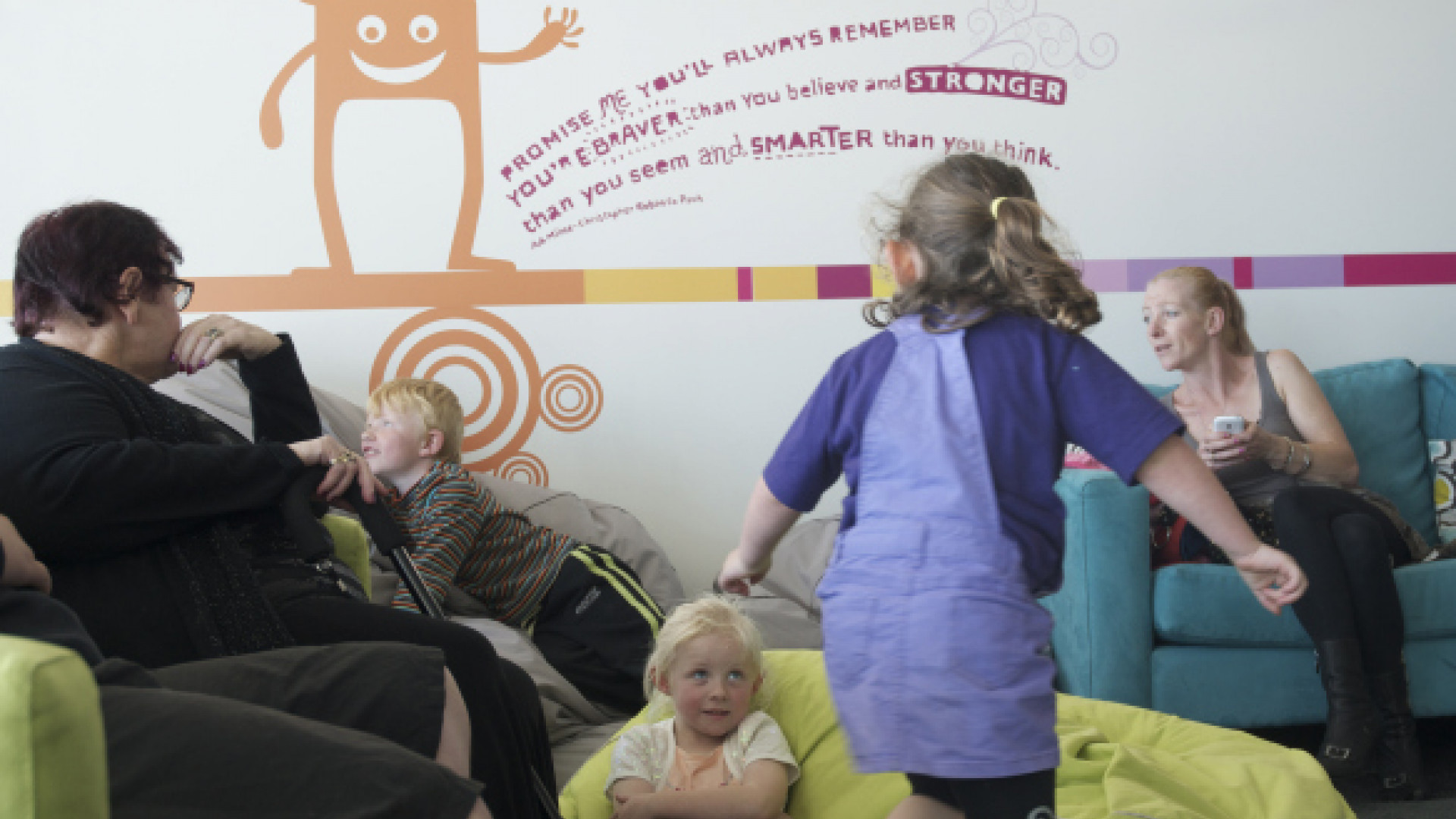
More recently we developed a series of scalable environmental graphics the Stand team could rollout across their seven regional villages. The graphics allow an environment to be created where children and their families can interact in a nourishing, welcoming and safe way. The style is fun and uplifting using a combination of direct and intimate language with playfully but engaging illustrations. The messaging celebrates the children, their families, the staff and the social workers who come into contact with each village.

We knew this work had the potential to inspire a change in the organisation but none of us foresaw the extent by which the new identity would unite people. The positioning statements ‘Stand for Children’ and ‘A world strong for children’ have become rallying cries for change, uniting politicians, funders and other child-support agencies. But the most significant change is happening on the ground in the villages themselves.
Last week I was fortunate enough to be invited to the opening of the new facility in Christchurch, purpose built following the destruction of the previous facility in the earthquakes. It was incredible to see the reaction of the children as they saw the new environment for the first time. They were surprised and delighted as they engaged with the graphics, joyfully laughing as they followed the characters and the stories around the walls of their new home. The atmosphere quickly manifested itself in an overwhelming sense of optimism. For kids that come from a rough upbringing, hope and pride are some of the best gifts we can give them.
Staff were very quick to thank us for our work and they openly expressed what a difference the new visual identity and environment was making on their lives. I feel immensely proud knowing that our design work has helped to transform an organisation which itself transforms the lives of thousands of children each and every year.
This article appeared in Marketing magazine, May/June 2014