Tailor your story to its audience
Client: Mighty River Power
Prior to their listing in mid 2013, Mighty River Power’s key stakeholders were their Government owners and energy sector analysts. A year out from listing, we were charged with developing their brand to better tell their story in a way that connected with investors and the wider community.
We developed a brand positioning and visual identity that told an integrated story - from generation to supply – tailored to the needs of corporate, community and internal audiences.
The Brief
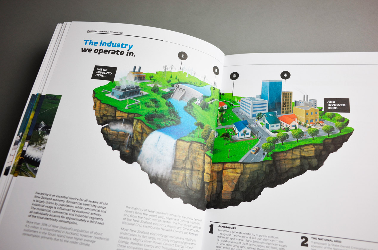
Mighty River Power asked us to update their visual identity to better tell the story of who they are and what they stand for. In particular, they wanted to demonstrate the diversified nature of their generation activities and to illustrate their role in the supply of energy to New Zealanders.
The Solution
The process started with a review of their current brand and how the market perceived them. We mapped this against their desired brand positioning and qualities. From here, we presented a range of brand progression options that stepped from subtle changes to a radical redesign.
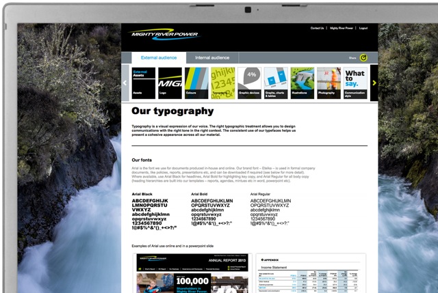
Once we agreed just how bold they were prepared to be, we worked on designing the specific visual identity elements for both a corporate and community look. This was a top-down and bottom-up process. Some elements such as the logo, fonts, tone of voice and colours were determined up front while other elements like icons, illustrations and graphics were developed on a job-by-job basis.
Part of the challenge of presenting a united Mighty River Power identity was that most of their 800 staff associated themselves more with one of the retail brands rather than the parent brand. This required the development of clear brand architecture to ensure the retail brands added value to the parent brand and vice versa. It also necessitated an internal brand identity that reinforced Mighty River Power while acknowledging the various retail team identities. The internal brand is more informal, colourful and dynamic.
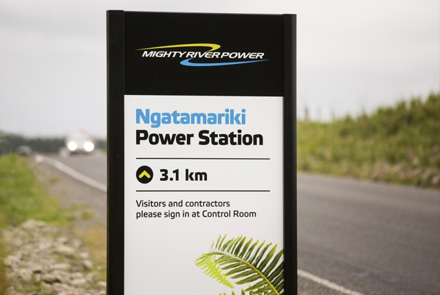
The rollout of the internal and external brand was a massive exercise in logistics management. New elements included stationery, website and intranet, social media pages, e-mail banners, merchandising, templates, brochures, annual reports, advertising, signage, a values programme and many more.
Two years since we commenced working with Mighty River Power, there are still elements being rolled out and there are on-going refinements of the identity to reflect on-going changes in the organisation. A thorough on-line portal was developed to detail the identity guidelines, contain all the brand assets such as logos, icons and photography and also allow application examples to be showcased.
The Results
The result has been a cohesive brand rollout that has helped change audience perceptions about Mighty River Power, both internally and externally.