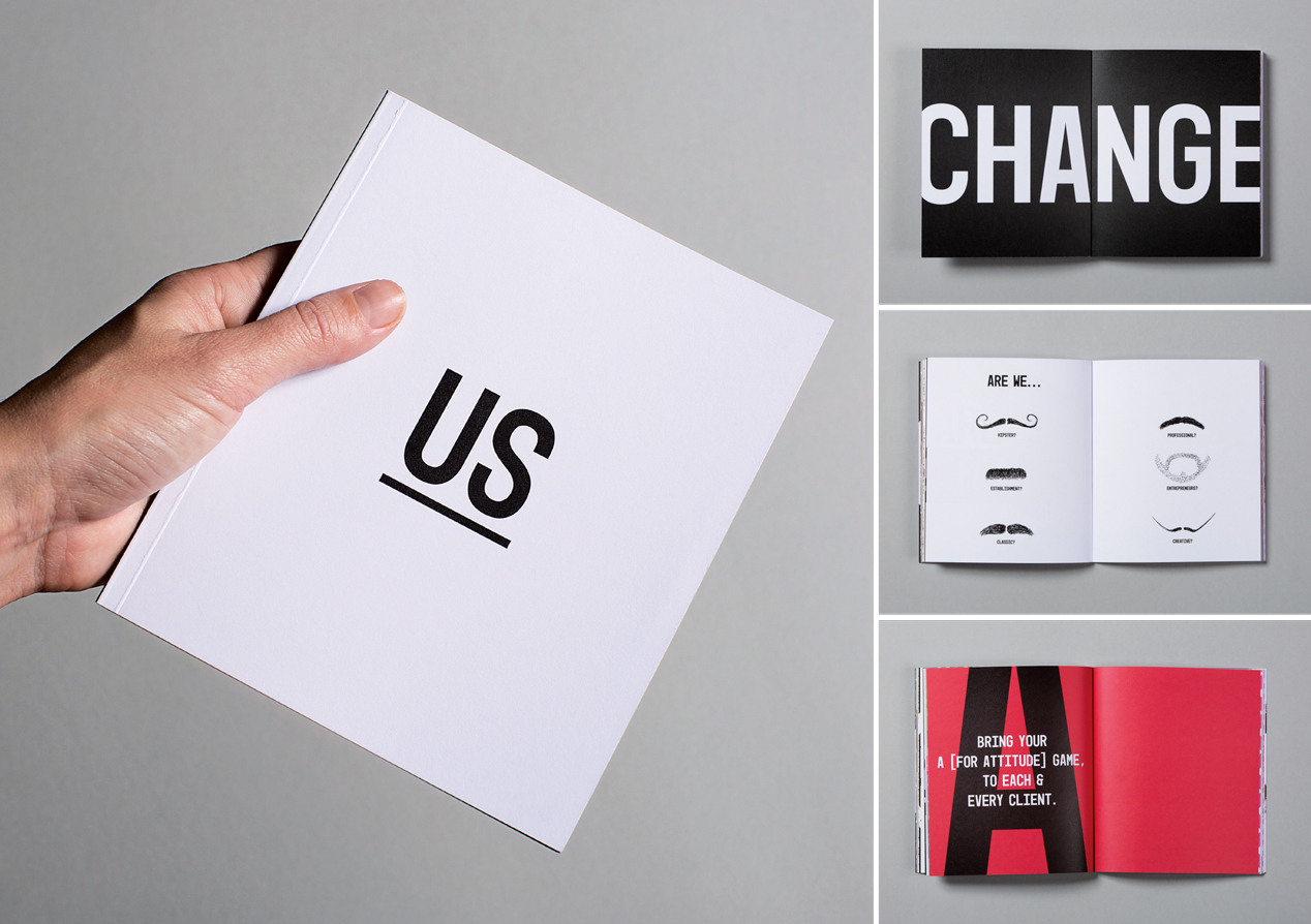
Bring your A (for attitude) game
Client: Meredith Connell
All law firms say they are different and then somehow go out of their way to show that they do exactly what all the other law firms do.
Meredith Connell (MC to their friends) brings a truly different attitude to getting results for their clients.
They asked us to help them define and express who they were, and why this makes a difference to their clients. They said they wanted a bold, individual brand with attitude. We listened, the whole time worried that they wouldn’t be this daring when it came to the execution. We needn’t have worried.
The Brief
Meredith Connell, a law firm with a rich history, felt their current brand didn’t reflect who they were. It didn’t capture the dynamic firm they’d become nor did it adequately express their vision and ethos. They wanted a brand that would push them to new heights, differentiate them in a homogenous industry, while still reinforcing their 90+ year heritage.
The Solution
We undertook a series of focus groups with approx. 60 staff to understanding where they’ve been and where they are going. We uncovered a modern entrepreneurial firm with young partners and a positive gender balance, where individualism is encouraged not stamped out. A ‘can do’ organisation focused on clients’ individual needs rather than formal hierarchy, process or even legal theory.
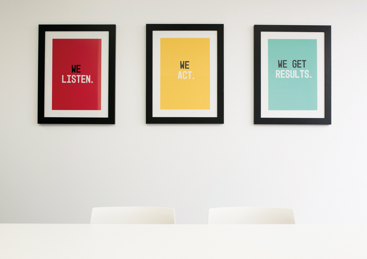
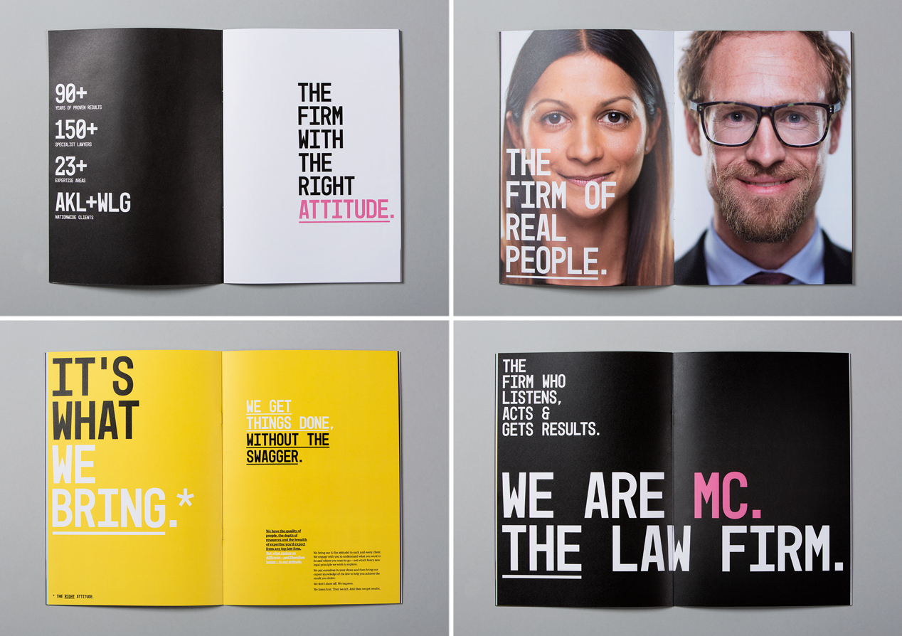
‘Bringing the right attitude’ became the idea behind the brand story and visual identity.
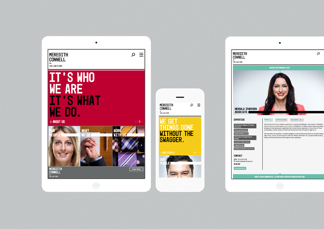
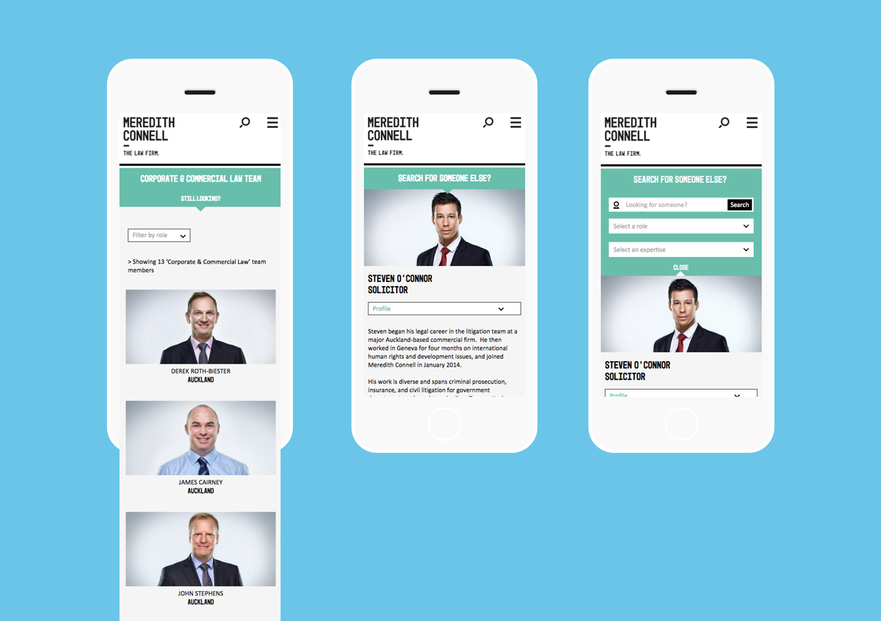
We decided early on that typography would play a major part of the identity, expressing attitude and giving them a real voice (not lawyer speak). Large, straight to camera, portrait photography made staff the primary focus, further reinforcing them as a people brand.
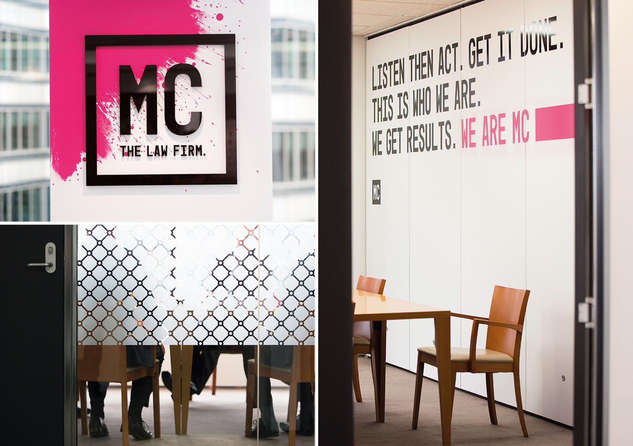
Strong colours, bold statement headlines and large photography achieved a look of confidence. The tagline “The Law Firm’ added to this; definitively stating this is who we are, this is what we do.
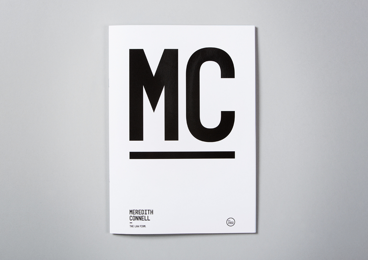
The firm’s name captures a lot of history, which we felt needed to be retained. We developed MC as a modern expression of the name and to further embed their informality and younger personality.
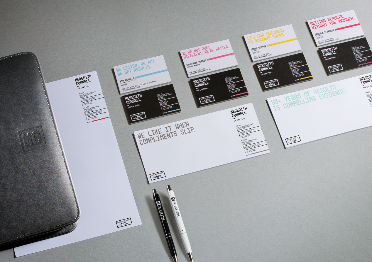
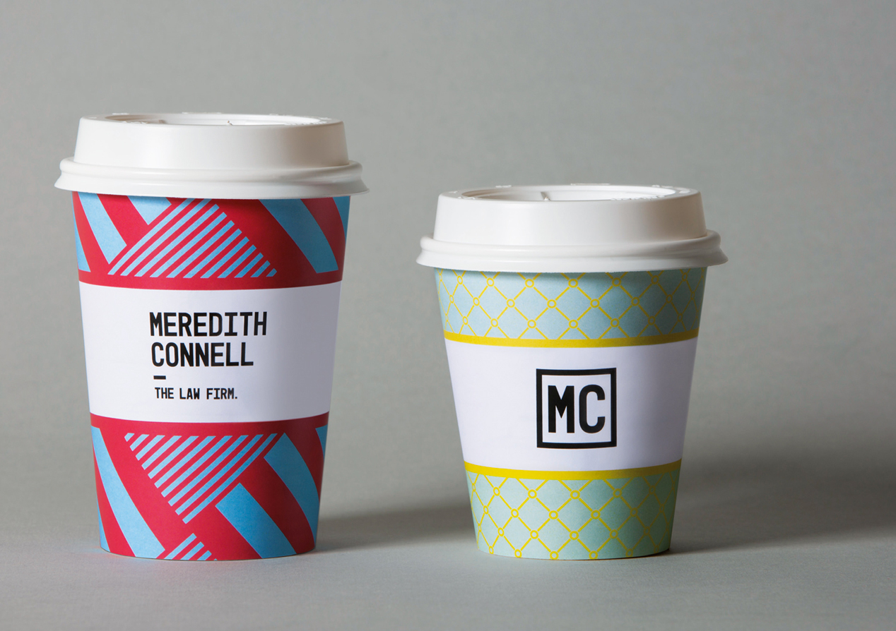
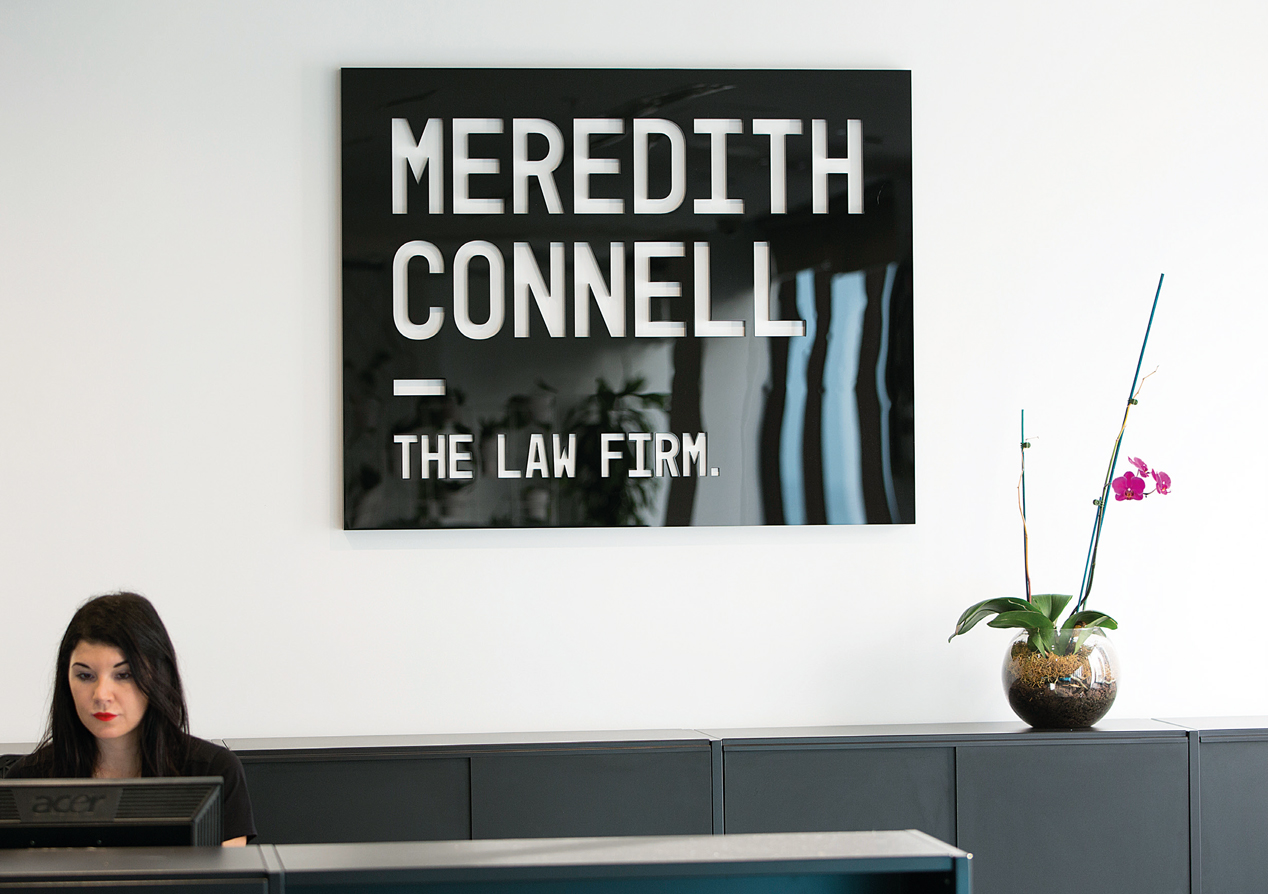
Our brand toolbox includes a primary and secondary logo, a heritage mark, new vibrant colour palette, typography, photography and graphics. We applied these to stationery, a responsive website, e-templates, advertising, internal and external launch material, expertise sheets, coffee cups and even the design and layout of their reception area. To further reinforce individualism, we created a series of business card statements and colours that staff could mix and match to best reflect themselves.
The overall look is bold, unexpected, engaging and gets people talking – all things good for a new brand.
The Results
We’d agreed with the client that a measure of success would be a strong reaction from the market, both positive and negative. On that basis, we’ve over-achieved with the new brand generating considerable industry, and wider media, discussion and debate. Internally, it has invigorated the business, fuelling a new energy and belief.