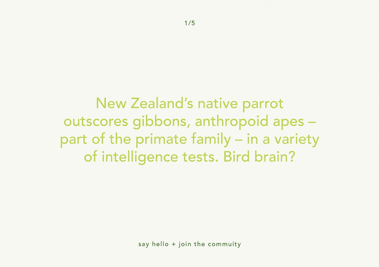
Inquisitive Learning
Client: Private
Engaging staff in a lifetime learning way of thinking helps both the employee and the empowering company.
A new internal online self-learning system needed a strong brand identity that would intrigue staff and encourage engagement.
The Brief
A large privately held New Zealand company approached us to help it launch its new learning management system. This represented a big change in how it approached learning, moving from old-style classroom training to online independent self-learning. The other significant difference was that this programme had to work as a single independent brand across all the organisation’s divisional companies.
The identity represents both the new programme and also the significant change in the way that training was being approached. Our job was to develop the identity and also demonstrate how it could roll out for the company’s internal team to run with.
The Solution
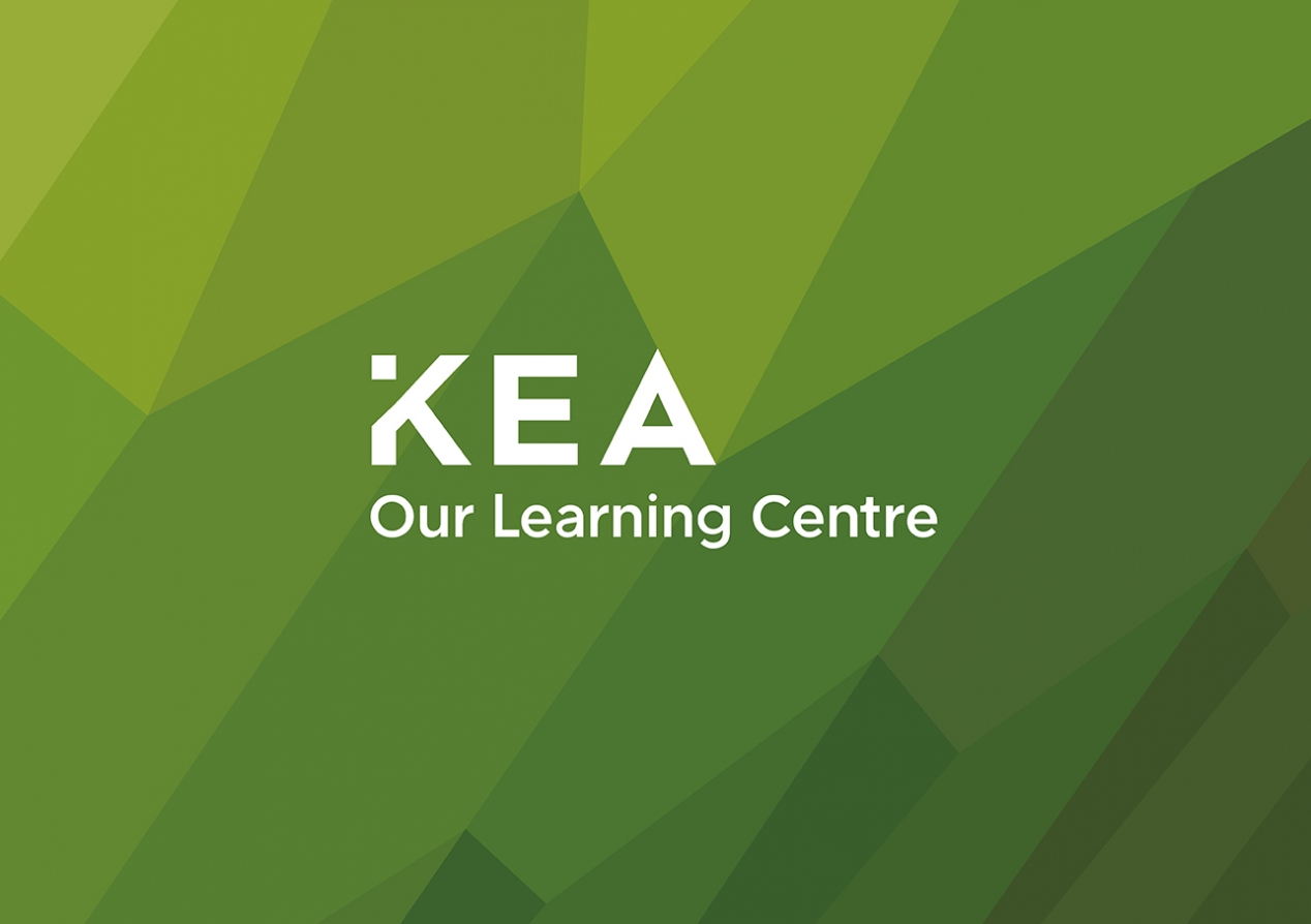
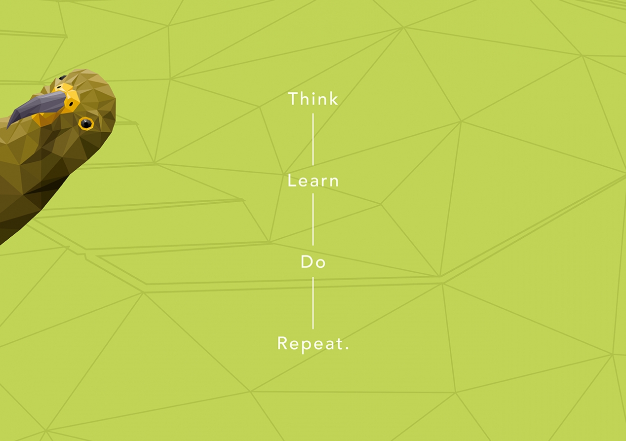
The client had the name Kea already, and we used this as the starting point for exploring a number of design directions, ranging from metaphor right through to literal. We elected to use the kea as the central design idea.
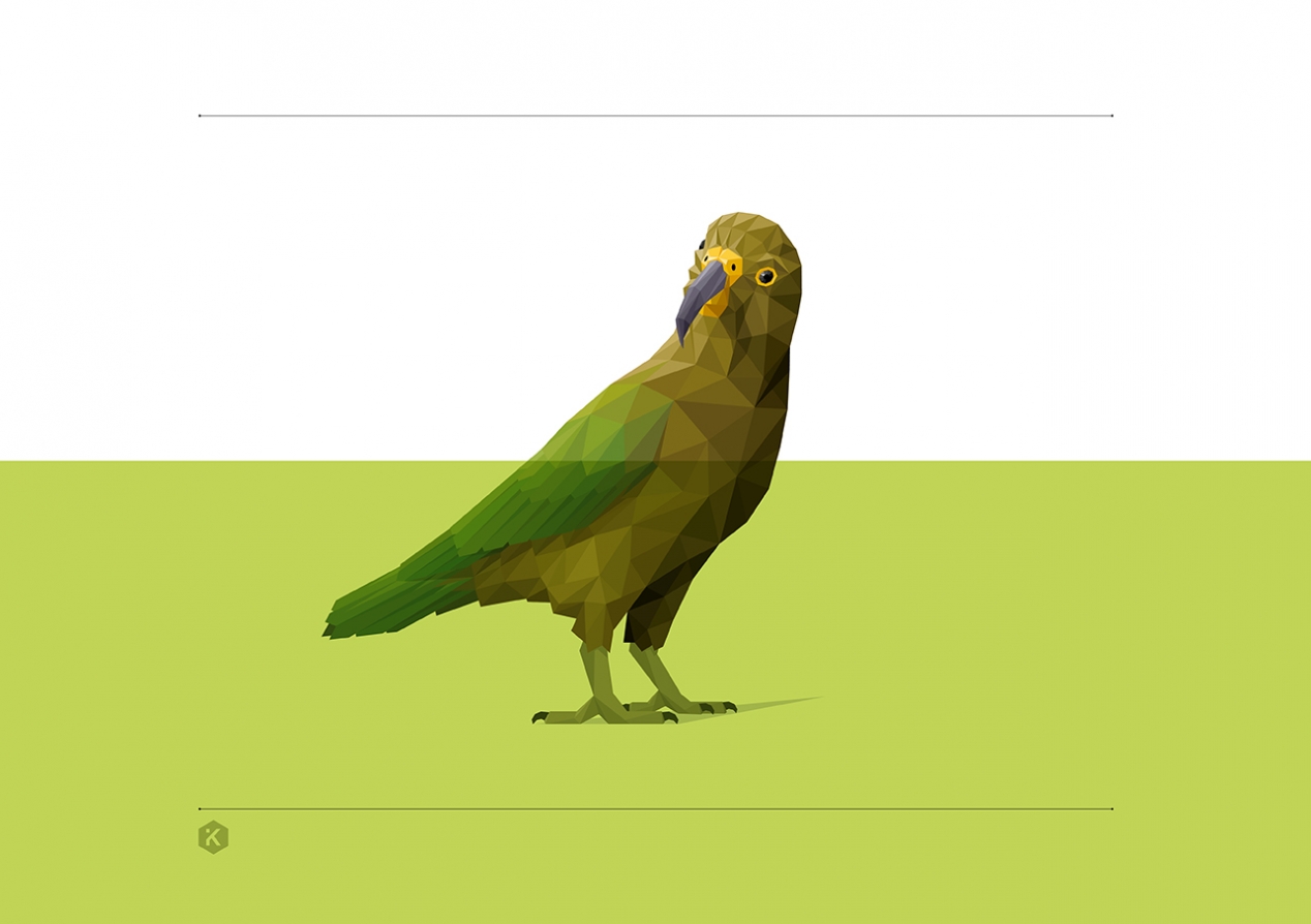
Working with an illustrator, we developed a stylised kea character, affectionately called Leah the Kea. Leah is a personification of the programme, with her technological and future-focused style mirroring the modern approach being taken to learning. We carefully crafted Leah’s expression to capture a cheeky, inquisitive and friendly personality – all characteristics of the self-directed learning our client wanted to promote.
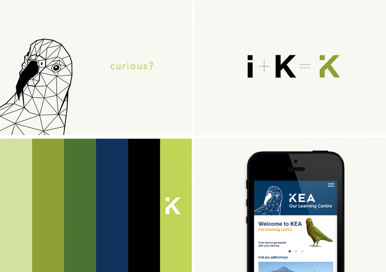
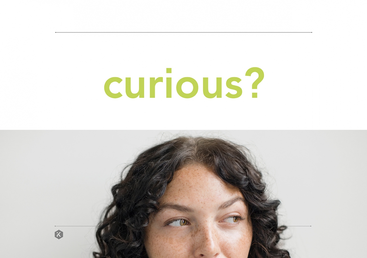
Leah’s stance is reflected in the K of the logo, which is further informed by the ‘i’ for information symbol. And her futuristic 3D appearance also inspired the design of big pull-out words – like curious – to reinforce what the programme stands for.
The colour palette seamlessly blends the colours of a kea with the client’s core brand palette. The central kea idea is further reinforced with a geometric graphic texture taken directly from Leah’s layered feather structure.
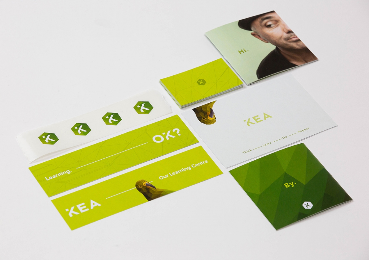
Combining all these elements created an identity toolbox that could be used to create a comprehensive launch programme. At one end, this toolbox generates energy and excitement as part of an awareness programme while working equally well at the functional end to inform training and instruction pages. We designed a number of sample executions to illustrate how the identity should work, informing how the in-house team approached the final material.
The Results
Leah has been described as “one cheeky and cool character who typifies exactly what this programme is all about”. Staff engagement with the programme has been high, and the client has indicated that the quality of the identity has been integral to this success. One inquisitive bird captured the hearts of many curious staff.