Clarity in thinking and design can help unravel the most complex of organisations and aid in cut through communication, writes Brian Slade.
I get a real buzz from coaching young designers as they are full of enthusiasm and fresh perspectives. Many approach design challenges in ways I would never have thought of which is great for my own learning and development. A common lesson I often have to impart is the importance of simplicity and clarity. Often, young designers can over-think a design brief and/or try to apply too many of their newly acquired design skills in one execution.
Anyone can use a plethora of bells and whistles to present something eye-catching but rarely does this approach deliver the clarity that one simple and cohesive design idea can achieve. Our recent work with Wynyard Group is a great example of using design to present complex information and tell a compelling and clear organisational story.
Wynyard Group are specialists in advanced crime analytics and critical threat assessment software that protects companies and countries from global threat, crime and corruption. It's all very James Bond! They have a strong brand identity within their business circles but very little public recognition. As part of their 2013 listing on the NZX they needed to create a broader understanding of who they are and what they offer. Prospective investors and media needed to be quickly guided through the complexities of this 'quiet,' under the radar, New Zealand global company.
Our fascination with international crime, double agents, counter intelligence and the like have been bread and butter for creative authors for decades. The likes of Arthur Conan Doyle, John Le Carre and Agatha Christie (my favourite is Wilkie Collins’ Moonstone) have guided us through this mysterious world but even they would struggle to navigate the complex regulation requirement that govern IPOs and often result in long, jargon-filled and legalistic offer documents.
Using Wynyard’s business as a metaphor, we sought to cut through the prescribed investment information to get to the true Wynyard story in a compelling and positive way.
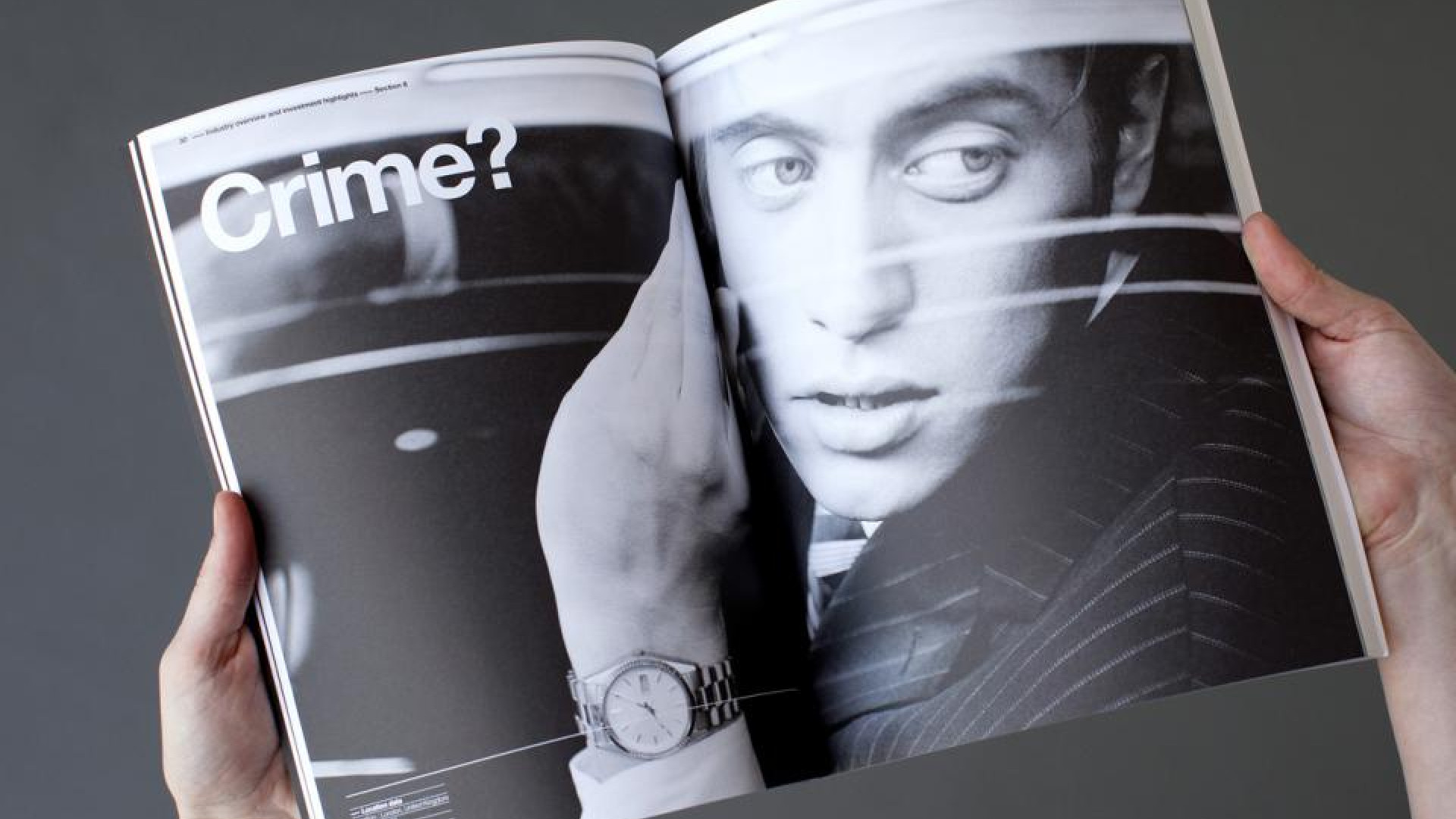
A 3mm hole finely drilled from the cover through the mandatory legal information, takes the reader to the core brand story on page 13. This simple device speaks to the accuracy and precision of Wynyard work, cutting through complex information to get to the crux of the matter. The singular black and white colour palette mimics the binary nature of data with small highlights of fluorescent orange drawing attention to a critical piece of information contained in the detail.
Reader understanding is heightened through engagement and we challenged readers to explore his or her own perceptions of where crime is being committed. Strong positive and negative photography reinforces that circumstances are not always what you think they are – behind an innocent everyday setting there could be a complex security situation at play. Compelling human photography was deliberately used to illustrate the real people behind the data.
The executive team portraits were shot individually around the world where Wynyard has a presence.
A strong visual hierarchy is utilised to structure and connect information, aiding the reader on their journey. Within this hierarchy a number of linking devices, such as linear thread lines and elongated em dashes, represent the possible causal relationship between information, people and events.
Assurance of stability is expressed in a timeline that again strips any 'noise' to a clear direct path.
To help the document stand out in a crowded investment market, a non-conventional format was used - again positioning Wynyard as not simply another organisation. This strong visual story approach extended from the printed document to a dedicated microsite.
Wynyard’s listing has been a success with the initial IPO exceeding subscription targets and the ongoing demand for shares seeing the price go from strength to strength. Market feedback suggests the clarity of their communications has been the true hero of this modern day crime story.
This article appeared in Marketing magazine, March/April 2013