Creative Director, Brian Slade, reviews aspects of Insight's body of work over the 2015 annual reporting season.
As designers, it’s what we do. The definition of graphics, from the Greek graphikos, is ‘something written e.g. autograph, visual images or designs on some surface, such as a wall, canvas, screen, paper or stone to inform, illustrate, or entertain…'
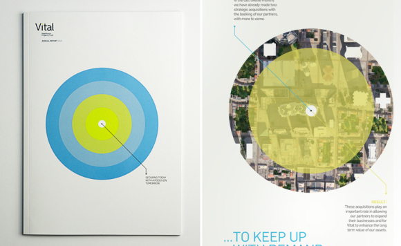
Vital is a great example of the use of graphics combined with the overall message to communicate with a very positive effect. The target device works well to keep on giving, used on a few spreads and as a cover for the shareholder newsletter - simple, clear and effective.
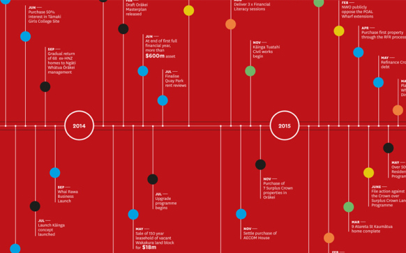
Ngati Whatua o Orakei has this delightful spread in it: a timeline that is a real pleasure to look at. Aesthetics are crucial in delivering strong graphics and this spread is confident, bold and assured. Giving me a sense that what I’m looking at is controlled and purposeful. I think this is a real win for the report.
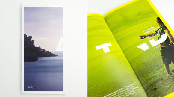
In a previous post in this series, we looked at the deconstructed typography in Stand Children’s Services report this year. However this report also illustrates how type can be treated as a graphic element to help tell the story. Each deconstructed typo’graphic’ element was balanced and considered in relationship to the image on the spread and the accompanying text.
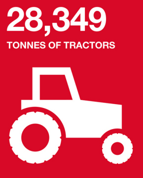
A strong part of our Ports of Auckland identity tool kit is the set of icons we use to illustrate the volumes and diversity that come across its wharves each year… 28,349 tonnes of tractors… and how many tonnes of bananas do you think?
Steadfast threw up its challenges this year. We were required to explore a very high number of cover options. It was finally resolved with this well-executed graphic cover that draws from the logo shape to house a diverse range of staff and customers linked through the client's logo.

We’ve been working with Transpower to graphically illustrate how they are connecting New Zealanders through the use of an illustrative image. We’ve been able to use this graphic flexibly across the reports to give the appearance of change without the base document elements changing. This has allowed for economic production and efficiencies.

If you’ve read this far congratulations… let me know what you think of these creative projects and keep an eye out for the LAST Powerful annual reporting results 05. Imagery.